04:58

Johannes Itten's colour contrast

Johannes Itten is known as one of the first people to identify colour strategies and can be used to invoke a reaction. He in particular would focus on colour harmony, he wrote in his primer book of colours "certain combinations of colours are pleasing, other displeasing or indifferent.". His research devised seven methods for colour co-ordination and utilizing hue's contrasting properties.

The contrast of saturation

A contrast of saturation refers to the difference of purity quality in colours.
From http://www.shutterchronicle.com/2009/03/johannes-itten-on-contrast/
"To darken colour with black deprives them, to different degrees, of their brilliance. Adding gray, or intermittingly black and white, to a colour, will lessen its intensity. Finally, mixing complementary colours will eventually produce a gray hue."


Contrast of light and dark
The opposition of black and white and the colours between them the spectrum known as chromatic colours.

The contrast of extension


He devised, expanding on Goethe's work, a systematical ratio of colour values e.g

yellow | orange | red | violet | blue | green
    9    :     8      :  6   :    3    :   4   :    6
The porportions for compimentary pairs are:

Yellow: violet = 9:3 = 3:1 = 3/4 : 1/4
Orange: Blue = 8:4 = 2:1 = 2/3 : 1/3
Red: Green = 6:6  = 1: 1 = 1/2 : 1/2


The contrast of compliments



Simultaneous contrast



The contrast of hue
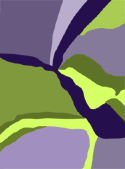


The contrast of warm and cool

16:30

Colour Proportion


When colours are put alongaise eachother in a composition our eyes will perceive a visual mix. This mix will vary depending on a variety of factors.
  • Dominant colour - This is the colour that covers the largest amount of the composition, the main overall colour.
  • Sub- dominant colour - The next in line is the sub-dominant colour which also covers much of the composition but not as much as the dominant.
  • Accent colour - This is a small amount of colour however it adds a contrast to the overall hue of the composition and so draws our eye towards it.
These colours can alternate between intensity aswell as proportion to create a variety of mixes.

In Goethe's colour theory he stated that white and warm hues have greather strength than black and cool hues. In particular he spoke on complimentary colours and how our minds constantly seek balance. Seeing complimentary colours in a composition satisfies this need.

Similarly contrast can determine the overall impact of a composition, this is known as dominant elements of design.

A composition where neighbouring colors have an overall moderate contrast and hue will overall create a moderately contrasted composition. This is the same for colour values in a composition. A composition made up of tints will create an overall light value to the composition and vice versa. An understanding of this can impact your control of the emotion or feeling you wish to reflect in a composition.

20:53

Colour in motion

Found a fantastic interactive website that teaches about 'colour in motion' through a series of short movies. Definately a good site for any artists to check out.

Each small movie goes through each colour and displays in animation how these colours are used in motion and what each they can potentially represent. In addition to this there is the interactive lab which has three projects. The first project challenges you to set up a scene to represent a word using the colours and props available. The second challenges you to select appropriate scenes for colours and the third allows you to have fun with colours in a kaleidascope!

 Here is the website below, check it out!

http://www.mariaclaudiacortes.com/colors/Colors.html

09:45

Colour Theory

Colour theory in basic consists of how to use colour properly and recognising the property of colours on their own and in relation to others. So I've set out to find and read a variety of articles on colour theory and put them into one place.

09:13

Purple

Even a purple frog!
I dedicate this post to my favourite colour purple!

There are several interesting facts about this colour. Such as during the times of Elizabethan clothing the people that were allowed to wear the colour purple was dictated by English law known as sumptuary law. Colours that people wore would inform others of their status, not just in wealth but also their social standing.

Where does the name and colour of purple originate?
It comes from a dye made from the mucus glands of a tropical sea snail. This discovery is associated with the legend of the God Heracles, a guardian deity. It is said that his dog bit the
snail and immediately its mouth turned purple. His companion a nymph named Tyrus, demanded that he dye her clothes this colour otherwise she would not sleep with him. And so the Tyrian purple dye was created.

Purple LandThe Greeks even went on to refer to the land of Tyre as "purple land" . It required 250,000 shellfish to produce one ounce of purple. In time it came to be worth more than gold.

Purple is associated with royalty, wealth and power, but why?
This can be traced back as far as the Greeks and Romans. Triumphant generals would wear robes of purple and gold whilst senators and consuls would wear togas with bands of purple. By the 4th century only the emporer was allowed to wear the best purple. They particularly liked a dark shade of purple which they described as "clotted blood".

In 1909 an austrian chemist assessed the chemical properties of the dye and realized it was almost the same as blue indigo extracted from an Indian plant called Indigofera tinctoria.

Even more surprising is that in 2007 a team of researchers concluded that early life may have been purple as plants used to use a different form of photosynthesis however the modern way prevailed, hence the reason that plants are now green instead of purple. This was more efficient.

08:30

How does 3D work?

With the recent buzz of 3D in cinemas I am curious to how it all works.

The illusion of 3D is quite a simple one and is only possible because we have two eyes, if we close one the illusion is broken. Our eyes are slightly apart and so they see from a slightly different angle each and because of this our eyes are able to create a sense of distance and depth which prevents us from seeing the world in 2D. Each eye sees 2D which is combined to create a 3D view.

The red and blue glasses use a kind of filtering system to our eyes. The screen displays two images and the glasses allow only one to enter each eye. Red/blue and red/green are the mainstream colours used for this effect. However this created bad image quality and so polarized is often preferred as it allows for colour images.

Polarization uses two projections of the same image with different polarization and the glasses only allow one projection into each eye.

As great as 3D can be I don't see what the whole sudden fuss about it is....like it's something new? It's been around for a long time but only now is it hyped about. So much so that the lion king has now been re-released as 3D in cinemas (not that I'm complaining as it was one of my favourite Disney films!). In my mind 4D should try and be incorporated into cinemas.....really get the audience into the movie by appealing to the other senses would be a big step forward in my opinion.

http://www.worldtvpc.com/blog/4d-technology-hits-south-korea/
This article gave me hope :D

19:58

The colour spectrum

The visible spectrum is the electromagnetic portion of the spectrum that is visible to the human eye. These colours are made up of different wavelengths and frequencies....so what is the rest of the spectrum that we don't see?

Some of the other lights that we don't see are infrared, radio waves, ultraviolet etc. The BBC recently did an interesting documentary highlighting this called Out of sight along with other interesting documentaries revealing that what we see can actually be very different from what is there.

A good example of how things can be different in different lighting is the honeybees. Honeybees have ultraviolet vision and so the world around them looks very different to our own. As a result of this flowers purposely have patterns that show through ultraviolet lighting in order to attract the bees to pollenate.In addition to this we also learnt through infrared that bees have a very specific set up within the hive. What initially looks like a scrambled mess is actually an organized process to raise the young. Under infrared light specific bees are shown to be warmer than others and these bees are keeping the young warm. Other bees will bring honey to feed and keep the energy levels of these bees up in order to stay warm. Something that would never be known without looking through infrared.

Apparently if all the invisible waves that we cant see were aligned along eachother they would go so far as to reach all the way to the sun! That's a lot of wave lengths! All around us are constant waves that we don't see, in particular radio waves as everyone these days have mobile phones.
Imagine all the light along this rainbow that we can't see....