04:59

Broken colour vs pure colour

Broken colour can also be described as damaged or diminished, it is essentially a colour that emerges when two colours mix and "fight" with eachother. The hue that emerges has lost strength and vitality from the incompatible elements in the mix. This can be both a pleasant and unpleasant result depending on the mix. It is a process also known as subtractive mixing.

In theory any two primaries combined should create a secondary colour however broken colour involves two complimentaries, one colour which is primary and one that is secondary, opposing eachother on the wheel. Red and green, blue and orange and purple and yellow.

Broken colours can however be made pleasing if eachother a lot of one colour is added or a little amount to create more of a balance in the mix. Broken colours are often dull on their own, however they mix well with other colours as they are essentially "cousins" of many other colours.

Broken colours create an overall dull feeling to a composition whereas pure colours are a lot brighter and therfore influence the overall feel of the composition with this. An example of this would be painting autumn and spring, autumn is a much more subdued season, the leaves are changing colour and falling and the weather is a bit colder with gentle oranges, yellows and reds. Whereas spring would be much more bright yellows and greens and blues to create that feel of spring.

04:39

Using colours to set a mood

The feel of colours is used in compositions to set a particular mood. For example blue is a relaxing colour, whereas red is a more alert and dangerous colour.

However if these rules are known they can also be broken effectively. Blue can reflect a calm and serene scene, but used in the right way can also reflect a dark and more menacing scene. Similarly with red is more often used to danger, however it can also be used as a warm colour, such as a sunset or love.

http://www.wdvl.com/Graphics/Color/color3.html uses a good example of the same scene in different colours and asks which is more inviting to you? It can depend on your mood.


This technique extends to all areas of art - photography, painting, movies etc will all use these techniques to influence and manipulate how the audience will perceive the image, how they will relate to it. It even extends to interior/exterior design as seen in this colour wheel.
http://www.landscapingnetwork.com/landscape-design/color-wheel.pdf
A great example of different moods and feelings set by different colours.

04:22

Impressionist broken colour theory

The theory of painting with broken colour was invented by the impressionists, by Claude Monet (1840 - 1926), as a way to give energy to a painting. It is a technique that is supposed to achieve the actual sensation of light itself. However it is a technique that can easily become empty and appear as more of just dabs of colour.
Another approch to broken colour is not to just give energy to the image but to also obscure the edges of the paintings allowing the mind to sense that the contours are there.
This way of painting broke how painters had been painting for many years Traditionally the colours would be mixed on a palette creating one single colour to work with, rather than mixing on the painting itself by dabbing the separate colours alongside eachother, to mix in our eyes from a distance.
This technique has never been a popular one and continues to be forgotten and not used. More often people are impressed with more photo-realistic type paintings.
They used a variety of methods in order to achieve this feel:
  • Colour washing - a translucent paint over a colour background to allow textures and patterns to be created on the thin layer.
  • Shading - Different shades to create an illusion of a transition from light to dark and vice versa.
  • Sponging - A cloudy soft appearance to the composition, there is sponging on (applying) and sponging off (removing)
  • Dry brushing/dragging - Dragging a dry brush through a wet glaze before it dries. This gives the illusion of wood or other woven surfaces.
  • Combing/Stippling - Similar to dragging except done with a comb.
  • Spattering - This involves striking a paintbrush with a piece of wood.
  • Ragging and rag rolling - A colour glaze painted over a different colour which is then distressed using a rag or cloth.
Overall the impressionists managed to create a fresh and original feeling to paintings.

04:58

Johannes Itten's colour contrast

Johannes Itten is known as one of the first people to identify colour strategies and can be used to invoke a reaction. He in particular would focus on colour harmony, he wrote in his primer book of colours "certain combinations of colours are pleasing, other displeasing or indifferent.". His research devised seven methods for colour co-ordination and utilizing hue's contrasting properties.

The contrast of saturation

A contrast of saturation refers to the difference of purity quality in colours.
From http://www.shutterchronicle.com/2009/03/johannes-itten-on-contrast/
"To darken colour with black deprives them, to different degrees, of their brilliance. Adding gray, or intermittingly black and white, to a colour, will lessen its intensity. Finally, mixing complementary colours will eventually produce a gray hue."


Contrast of light and dark
The opposition of black and white and the colours between them the spectrum known as chromatic colours.

The contrast of extension


He devised, expanding on Goethe's work, a systematical ratio of colour values e.g

yellow | orange | red | violet | blue | green
    9    :     8      :  6   :    3    :   4   :    6
The porportions for compimentary pairs are:

Yellow: violet = 9:3 = 3:1 = 3/4 : 1/4
Orange: Blue = 8:4 = 2:1 = 2/3 : 1/3
Red: Green = 6:6  = 1: 1 = 1/2 : 1/2


The contrast of compliments


Simultaneous contrast


The contrast of hue


The contrast of warm and cool

16:30

Colour Proportion


When colours are put alongaise eachother in a composition our eyes will perceive a visual mix. This mix will vary depending on a variety of factors.
  • Dominant colour - This is the colour that covers the largest amount of the composition, the main overall colour.
  • Sub- dominant colour - The next in line is the sub-dominant colour which also covers much of the composition but not as much as the dominant.
  • Accent colour - This is a small amount of colour however it adds a contrast to the overall hue of the composition and so draws our eye towards it.
These colours can alternate between intensity aswell as proportion to create a variety of mixes.

In Goethe's colour theory he stated that white and warm hues have greather strength than black and cool hues. In particular he spoke on complimentary colours and how our minds constantly seek balance. Seeing complimentary colours in a composition satisfies this need.

Similarly contrast can determine the overall impact of a composition, this is known as dominant elements of design.

A composition where neighbouring colors have an overall moderate contrast and hue will overall create a moderately contrasted composition. This is the same for colour values in a composition. A composition made up of tints will create an overall light value to the composition and vice versa. An understanding of this can impact your control of the emotion or feeling you wish to reflect in a composition.

20:53

Colour in motion

Found a fantastic interactive website that teaches about 'colour in motion' through a series of short movies. Definately a good site for any artists to check out.

Each small movie goes through each colour and displays in animation how these colours are used in motion and what each they can potentially represent. In addition to this there is the interactive lab which has three projects. The first project challenges you to set up a scene to represent a word using the colours and props available. The second challenges you to select appropriate scenes for colours and the third allows you to have fun with colours in a kaleidascope!

 Here is the website below, check it out!

http://www.mariaclaudiacortes.com/colors/Colors.html

09:45

Colour Theory

Colour theory in basic consists of how to use colour properly and recognising the property of colours on their own and in relation to others. So I've set out to find and read a variety of articles on colour theory and put them into one place.

09:13

Purple

Even a purple frog!
I dedicate this post to my favourite colour purple!

There are several interesting facts about this colour. Such as during the times of Elizabethan clothing the people that were allowed to wear the colour purple was dictated by English law known as sumptuary law. Colours that people wore would inform others of their status, not just in wealth but also their social standing.

Where does the name and colour of purple originate?
It comes from a dye made from the mucus glands of a tropical sea snail. This discovery is associated with the legend of the God Heracles, a guardian deity. It is said that his dog bit the
snail and immediately its mouth turned purple. His companion a nymph named Tyrus, demanded that he dye her clothes this colour otherwise she would not sleep with him. And so the Tyrian purple dye was created.

Purple LandThe Greeks even went on to refer to the land of Tyre as "purple land" . It required 250,000 shellfish to produce one ounce of purple. In time it came to be worth more than gold.

Purple is associated with royalty, wealth and power, but why?
This can be traced back as far as the Greeks and Romans. Triumphant generals would wear robes of purple and gold whilst senators and consuls would wear togas with bands of purple. By the 4th century only the emporer was allowed to wear the best purple. They particularly liked a dark shade of purple which they described as "clotted blood".

In 1909 an austrian chemist assessed the chemical properties of the dye and realized it was almost the same as blue indigo extracted from an Indian plant called Indigofera tinctoria.

Even more surprising is that in 2007 a team of researchers concluded that early life may have been purple as plants used to use a different form of photosynthesis however the modern way prevailed, hence the reason that plants are now green instead of purple. This was more efficient.

08:30

How does 3D work?

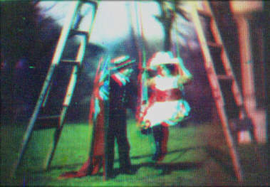
With the recent buzz of 3D in cinemas I am curious to how it all works.

The illusion of 3D is quite a simple one and is only possible because we have two eyes, if we close one the illusion is broken. Our eyes are slightly apart and so they see from a slightly different angle each and because of this our eyes are able to create a sense of distance and depth which prevents us from seeing the world in 2D. Each eye sees 2D which is combined to create a 3D view.

The red and blue glasses use a kind of filtering system to our eyes. The screen displays two images and the glasses allow only one to enter each eye. Red/blue and red/green are the mainstream colours used for this effect. However this created bad image quality and so polarized is often preferred as it allows for colour images.

Polarization uses two projections of the same image with different polarization and the glasses only allow one projection into each eye.

As great as 3D can be I don't see what the whole sudden fuss about it is....like it's something new? It's been around for a long time but only now is it hyped about. So much so that the lion king has now been re-released as 3D in cinemas (not that I'm complaining as it was one of my favourite Disney films!). In my mind 4D should try and be incorporated into cinemas.....really get the audience into the movie by appealing to the other senses would be a big step forward in my opinion.

http://www.worldtvpc.com/blog/4d-technology-hits-south-korea/
This article gave me hope :D

19:58

The colour spectrum

The visible spectrum is the electromagnetic portion of the spectrum that is visible to the human eye. These colours are made up of different wavelengths and frequencies....so what is the rest of the spectrum that we don't see?

Some of the other lights that we don't see are infrared, radio waves, ultraviolet etc. The BBC recently did an interesting documentary highlighting this called Out of sight along with other interesting documentaries revealing that what we see can actually be very different from what is there.

A good example of how things can be different in different lighting is the honeybees. Honeybees have ultraviolet vision and so the world around them looks very different to our own. As a result of this flowers purposely have patterns that show through ultraviolet lighting in order to attract the bees to pollenate.In addition to this we also learnt through infrared that bees have a very specific set up within the hive. What initially looks like a scrambled mess is actually an organized process to raise the young. Under infrared light specific bees are shown to be warmer than others and these bees are keeping the young warm. Other bees will bring honey to feed and keep the energy levels of these bees up in order to stay warm. Something that would never be known without looking through infrared.

Apparently if all the invisible waves that we cant see were aligned along eachother they would go so far as to reach all the way to the sun! That's a lot of wave lengths! All around us are constant waves that we don't see, in particular radio waves as everyone these days have mobile phones.
Imagine all the light along this rainbow that we can't see....

08:05

Debate of colour in modern movies

In my search for research on colour in movies in modern times I've encountered an interesting debate and opinion that colour quality in movies has become worse. This was quite surprising as I was expecting that quality would have improved with recent technology, but as I read the articles I began to see the point and this is largely due to modern techniques of colour grading to create a specific feel to a movie.

http://theabyssgazes.blogspot.com/2010/03/teal-and-orange-hollywood-please-stop.html

This article in particular debates that hollywood movies now all consist of overall orange and blue tints compared to the bright colours of older movies. This apparently began in 2000 with the first scanned movie "Oh brother, Where art thou?" as seen above.

It began being used and introduced as teal and blue are complimentary colours and so this made the characters "pop" on screen.

http://www.slashfilm.com/orangeblue-contrast-in-movie-posters/

This article takes this view even further showing many examples. I've noticed a feeling of movies all being the same recently but would never have put it down to something as simple as the colours used! This really surprised me and I'm sure I will now notice it everywhere.....unfortunately. However I'm sure this doesn't apply to absolutely all movies. Maybe this is another phase of Hollywood and another will soon come along.

This also reminds me of a similar thing I saw about modern music all being the same:
http://www.youtube.com/watch?v=5pidokakU4I

Denver Riddle responded with a blog post explaining the use of these colours
http://www.digitalcinemafoundry.com/2010/04/02/why-the-so-called-blockbuster-look-color-grading-explained/

Although it makes sense that these colours create a more appealing image, does it need to be so overused?

06:41

Colour in early movies

It is not known when the first full colour movie was created or which movie it was but it's known it was first introduced when hand cranked cine cameras were used.

Many methods were used since the introduction of three strip full colour in 1934 however colour in movies has been found to go back even as far as 1899, as seen to the left. From the image it is known that the camera used did not expose all the colours simultaneously as the moving people have artifacts whereas the ladders do not. This is why the early technicolor systems were so successful as the lenses manage to expose simultaneously.

There were a variety of methods such as:
  • Hand Coloured films - This involved painting each individual frame, tinting film stock, toning black and white emulsion etc.
  • Natural Colour films - Additive Colour - This method meant that the film did have its original colour whilst being filmed however being additive the colours were on a separate film and combined/overlapped with the original.
  • Natural Colour Films - Subtractive Colour - This method has complimentary colours dyed into the emulsion, this way emits more light than additive.

As well as many other methods and types of film combinations used however technicolour and kinemacolour processes became the most popular.


11:17

Colour Therapy

Many ancient cultures used colour in practise as a therapy form, to heal, and some is even still used today as a holistic or alternative therapy. It is known as chromotherapy and sometimes referred to as light therapy or colorology.

In this treatment different colours were used to create different reactions:

  • Red - Stimulate body and mind.
  • Yellow - Stimate nerves and purify the body.
  • Orange - Heal lungs and increase energy levels.
  • Blue - Soothe illnesses and treat pain.
  • Indigo - Was thought to help skin problems.
However most psychologists believe that the impact of colour is exaggerated and will have different meanings in all different cultures. Research has been carried out that has proved that the effects of colour are only temporary to the initial exposure of the colour and that overtime the effect can become neutral overtime or even reversed.

Further studies have also shown that colours can have an impact on performance. For example students exposed to the colour red before exams can have a negative impact on performance, however red has shown to increase reactions and speed which may be useful for athletes. Similarly interesting impacts of colour is the colour blue that causes loss of appetite and blue plates are now recommended as a part of diet plans.

10:55

The psychology of colour

It is known by artists and designers that colour can dramatically affect moods and a powerful communication tool. However this is not exactly the same for everyone. People's feelings on colour can be deeply personal and rooted in different experiences or culture. An example of this is the colour white, in Western culture is symbolises purity, whereas in Eastern countries it is often a symbol of mourning.

There are colours that seem to have a universal meaning such as the warm colours (reds, yellows and oranges) that can create a range of feelings from warmth and comfort up to anger and hostile. On the flip side are the cool colours (blues, purples and greens) that are calm but also can represent sadness or insecurity.

Each of your favourite colour's are seen to represent something:

  • Black - A symbol of mourning in many cultures
    - Absorbs the light of the other spectrums
    - Can be used as a symbol of menace or evil but also power
    - Represented life and rebirth in Egypt
    - Slimming quality in fashion/ black is used in language (black belt, black tie, black cat, blackout, black list, black market)
  • White - Purity or innocence.
    - Bright and creates a sense of space or adds highlights.
    - Cold, bland, sterile
    - Rooms painted completely white can be spacious but also unfriendly.
  • Red - Bright and invokes strong emotions.
    - Love, warmth and comfort
    - Intense and angry colour
    - Red in language: redneck, red-hot, red-handed, paint the town red, seeing red.
  • Blue - A favourite of many people - most preferred by men
    - Calmness and serenity,
    - Sadness
    - Encourages productiveness
    - Not appetizing - diet plans recommend eating off a blue plate as you will want to eat less! Humans natural instinct is to avoid food that is poisonous and often blue is a sign of food spoiled or poison.
    - Lower pulse rate and temperature.
    Blue in language: blue moon, blue Monday, blue blood, the blues
  • Green - Nature
    - Tranquility, health and good luck
    - Researches have found that it improves reading ability.
    - Symbol of fertility.
    - Calming
    - Relieve stress
  • Yellow - Cheery and warm
    - most fatiguing to the eye
    - can create frustation and anger
    - increase metabolism
    - most attention grabbing colour
  • Purple - Symbol of royalty and wealth
    - Wisdom and spirituality
    - Does not often occur in nature and so can be exotic or atificial.
  • Brown - A natural colour that invokes strength.
    - Sadness and isolation
    - Warmth, comfort and security
    - Sophisticated
  • Orange - Energetic colour
    - Excitement, enthusiasm and warmth.
    - Often used to draw attention.
  • Pink - Love and romance
    - Calming effect
    - Researchers have found the calming effect is only during initial exposure and that overtime it can cause agitation.

11:21

Movie Bar Codes

Back to University and the Digital Cinematography classes have begun and so does the research.

We were introduced to colour scripts and it was discussed how colour is used within films, very specific colours to show specific emotions and an overall feel to a movie.

This class reminded me of something I had seen before called Movie Bar Codes on tumblr. The "bar codes" consist of all frames of a film compressed to create an image similar to a barcode. By looking at these images you can easily see the overall colours used in either the film or in specific sections of the film.

Bambi (1942)
Aladdin (1992)
Already between these two Disney movies there is a large difference between the overall colours used in the films. Bambi is largely consisting of more natural colours of gentle browns, greens and blues, reflecting the nature of the film itself. Whereas in Aladdin the colours have far more contrast in them, much more vivid and bright blues, reds and purples. Such a large contrast creates a big difference between the overall feel of the movies.


Inception (2010)

Jaws (1975)

Here are two examples of films that clearly have a very specific tone to the entire film, both consisting of mainly dark brown and grey colours and slight blue.

These are all found, and many more at: Movie Bar Code Tumblr

04:04

let yourself feel. from Esteban Diácono


let yourself feel. from Esteban Diácono on Vimeo.

15:21

University 3D works so far

3D City Street Project


3D Car Project Mazda RX-8


First University Project - Podracer

My first organic model - 3D animal project